Anzushiro Draco Forma - Dragon Girl Anzu, v2
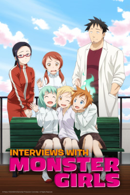
The new anime season kicks off in
earnest this weekend after the holidays. One series in particular I am looking
at is called, Interviews with Monster
Girls. The spiritual successor to Daily
Life with Monster Girls, this series involves a biology teacher who ends up
with three of the titular monster girls in his class. It promises to be as much
of a habitual line-stepper romantic comedy as Daily Life was. It should be fun to see what this newest iteration
of the renewed monster-girl trope brings.
In celebration of the new monster girl series, a new monster girl image. And, because Dark Side of Dimensions, the newest Yu-G-Oh movie is getting its North American release this month, a monster girl from the duel monsters world.
Now, I know folks were probably really hoping I’d come back with something involving Kali, but I have not completely finished that special project (it’s such a large piece and has a color palate issue I keep butting against).
That being said, this is a very
good project in its own right. There is a lot going on with this this project,
so please bear with a bit of a longer than normal explanation if you’re
interested in the details. I’ll break it all down with headings so it’s easier
to navigate if there’s something specific you’re curious about. So, let’s get
started with Dragon Girl Anzu, v2.
Base Line Art
The original Dragon Girl Anzu image
I created was a
 perfectly fine piece all its own, but it was lacking in a
certain aspect in that I essentially completed it while hiding my indecision
regarding the specific case of where as a monster girl image I would only add
the tail and wings of a dragon to her, or add the claws of one too. It was
without a doubt a very basic question of how “monstrous” of an appearance I
wanted to give her. As you can see, I did give her the hands and feet of a
dragon.
perfectly fine piece all its own, but it was lacking in a
certain aspect in that I essentially completed it while hiding my indecision
regarding the specific case of where as a monster girl image I would only add
the tail and wings of a dragon to her, or add the claws of one too. It was
without a doubt a very basic question of how “monstrous” of an appearance I
wanted to give her. As you can see, I did give her the hands and feet of a
dragon.

I could have played around a bit
with the original work to show her hands at least and reveal an answer, but I
thought it was better to just start almost from scratch with a brand-new image.
I gravitated towards a more mature, seductive, and alluring general pose, as
opposed to what was meant to be a more innocent, childish, appearance in the
first version.
Overall, I addressed a couple of
the other issues I had with the original too. For one, I made the wings much
larger, creating that sort of grand visage you can imagine seeing were they on
full display. It’s one of my favorite techniques – use the limitation of space
to enhance the image of what can’t be seen. You can’t see the full scope of the
wings, but you have a good idea of how they should look, so leaving critical
parts out of view conveys a sense of how large they could be without stating it clearly.
The other thing from the original I
wanted to address was the tail. Much more so than the wings, I really felt the
tail wasn’t done well enough in my first go. Really, Slifer the Sky Dragon is
basically an anaconda with relatively small legs and arms, two mouths, and big
wings. Simply put, the tail was far too short in the first version. I remedied
that adequately, I believe, with the tail now being roughly 2 or 2.5 times the
length of her body.
Finally, I added a crown. The
debate about how to represent Slifer’s head never really resolved itself any
differently. I was, and still am, against having actual horns growing out of her
head, so I stuck with the idea of having her hair sticking up. The hair is once
again styled to have a portion sticking up in the approximate form of Slifer’s
crown. But, I have a significant portion fully obstructed and off screen. This
is a combination of reasons. First, the desire to show off the wing and tail
trumped the unusual hairstyle, so to retain the basic framing of those two
aspects, the hair ended up out of full view. The second reason is because I
still am not completely comfortable with the concept. Something about the way I
end up drawing the hair just still looks too far off from what I’d be
comfortable with or can comfortably reproduce.
Slifer also has that jewel in the
center of its forehead. Given the way her hair sits, my first inclination of
making it a third eye would not work unless I wanted to change Dark Magician
Girl’s hairstyle. I didn’t, so the best way of getting that jewel in place was
obviously only left with having it be part of a crown. I was a little skeptical
of that only because I went with the intent throughout the project to have all
of the facets of Slifer represented as organic to Anzu’s body, but there really
wasn’t another way around the issue of the jewel so far as I could see.
Colors – Wings, Tail, and Forearms
There isn’t much surprise in terms
of color palate. Shades of red and blue always tend to dominate my Dark
Magician Girl pictures out of deference to her native color scheme. Bring
Slifer into the mix, and there’s little surprise that you get mainly red
throughout the image.
 I can’t say that the red here is a
match to the red of any particular Slifer image. It’s probably close to the red
of the original card art for the unofficial Slifer card from back when the
Egyptian God Cards were first shown in the Yu-Gi-Oh anime. I eyeballed a shade
of red that I thought worked well and was close enough to be thought a match,
rather than directly copying that shade.
I can’t say that the red here is a
match to the red of any particular Slifer image. It’s probably close to the red
of the original card art for the unofficial Slifer card from back when the
Egyptian God Cards were first shown in the Yu-Gi-Oh anime. I eyeballed a shade
of red that I thought worked well and was close enough to be thought a match,
rather than directly copying that shade.
I did a rough fade between the
human upper arm and dragon lower arm. The same principle would apply to the
legs if you could see her calves. Essentially, this was another question as to
what extent her body is that of a human, and to what extent it is of a dragon.
Rendering it this way, you arrive at a “core” that is human, with everything
outward from there being a dragon. The jagged meeting point should represent
the idea of the two parts blending, not in a seamless way, but in a way that
nevertheless is not particularly simple to separate.
Dress Color
For her dress, again I didn’t
specifically attach myself to any particular iteration of blue I actually
experimented with a number of shades of blue, even at one point trying a few
shades of purple. But, in the end, a deep blue is one of my favorite colors
next to a nice burnt orange. Orange would have flooded this image with far too
much red shades for my liking, so blue had to be the choice, and I went right
with a favorite.
Eye Color
 I have often gone back and forward
between blue and green for Anzu’s eye color. I do like the green of Dark
Magician Girl’s actual eye color, but I generally save it for my Anzu pictures
more intended to reflect “Dark Magician Girl” than “Anzu Rosencraft” or
“Anzushiro” as this project does. That’s why blue was the first option. But the
eyes didn’t stand out enough from my liking. Particularly next to a golden
yellow, there just wasn’t enough there with the eyes using blue, so I went to
green. This made the eyes stand out more, and complimented well with the
golden-yellow sclera.
I have often gone back and forward
between blue and green for Anzu’s eye color. I do like the green of Dark
Magician Girl’s actual eye color, but I generally save it for my Anzu pictures
more intended to reflect “Dark Magician Girl” than “Anzu Rosencraft” or
“Anzushiro” as this project does. That’s why blue was the first option. But the
eyes didn’t stand out enough from my liking. Particularly next to a golden
yellow, there just wasn’t enough there with the eyes using blue, so I went to
green. This made the eyes stand out more, and complimented well with the
golden-yellow sclera.
At first I went with the black
pigmented sclera to enhance the “inhuman demon” image of her overall. But, Slifer
actually has golden orbs for eyes (no iris, no pupil), so I went with a
yellow-eyed-demon look for this project.
And, as usually is the case, I gave
the pupils a fang shape. I’ve generally used this feature in virtually all
works where the character is meant to exhibit some manner of inhuman
characteristics. I experimented with pigmenting the pupils as well, but it
didn’t seem to look quite right. It made for too much going on in the eyes, so
I just left them black.
Hair Color
I went with the pink that I’ve
occasioned to use when playing Anzu off her relation to her sister Rini. There
isn’t a particularly good reason for this choice. I knew I didn’t want to go
with her normal Dark Magician Girl sandy blonde, and in all honesty it would
have made much more sense if I went with the white she rightly should have here
as “Anzushiro of the Two-Six, Goddess of the Snow White Crown.” But I like the
look of her with pink hair, so I started doing it without really thinking. It
really wouldn’t be that hard even now to go back and change it to white, but
think I’ll stick with pink.
Alternatively, I could have made
her actual crown white. But, the only reason the crown is there is to get the
jewel on top of her head. That made the crown a stand-in element for Slifer, so
I wanted to retain the basic principle of having Slifer specific elements
retain Slifer’s color scheme.
Claw Color
The claws were done to have a
“steel” look, just like the much earlier mentioned image of Slifer. Technically
speaking I used a light grey, and then just overlaid various shades to add the
depth and gleam. No surprise there, or much else to really talk about.
Complexion
The skin tone is a bit of a wild
pitch. That’s not to say there’s anything particularly odd about it, only that
I just sort of went for something. It’s clearly not as dark as it could be if I
went with other works I’ve done, those mainly linking her more directly to Dark
Magician Girl’s past as Mana. At the same time, it’s not as light a complexion
as some official Dark Magician Girl art either. Her skin tone was the last
color choice I made before working on the background, but was the first element
of color added to the image. It ended up coming out looking a good bit lighter
than it actually is, mainly because all the other colors throughout the image
are so dark, especially contrasting with such a dark background. I did want it
a little darker, but I got a little lazy and didn’t want to be bothered with
going back and redoing it.
Background
The background was a bit of a headache.
I gave no consideration to it at all until I was almost done with the rest of
the project, so I wasn’t sure at all what I should do. I thought of some sort
of outdoor scene, but resisted it heavily at first. That left only an indoor
scene, but given how she’s sitting, there weren’t a lot of great options. She’d
almost certainly have to be sitting on a floor or on a bed. A floor would have
been too plain and lacking much detail unless I came up with some interesting
patterned rug to be under her, or went expertly detailed and made some sort of
wood or stone floor with varying grains and colors and the like. Doing this
project while going to work in the break between school semesters, and then
coming down with some terrible mix of the flu and a respiratory tract
infection, I simply lacked the time to do something that involved.
The idea of her on a bed had a
certain intrigue to it, especially as a means of further playing up the more
mature and sexy angle. But I pulled back from that option because it didn’t
make rational sense for her to be in a bed with those wings like that. She’d
either have to be relatively tiny or sitting on like two or three Cali Kings to
fit that wingspan.
So, that put me back outside in
some form or fashion. To achieve a merging of the two concepts, I considered having
her on a blanket, so as to suggest a picnic. The choice between day or night
was basically made based on whether I wanted to draw trees. I figured if it was
daytime I would need something to fill the empty space center top of the
picture, so I would need to add mountains or a tree or something. I hardly, if
ever, draw mountains, so that was an interesting inclusion. But I didn’t feel like
doing trees, so I went with night, were I could occupy that region of the image
with stars.
Once I did the stars, I was really,
really, really, tempted to make this into some manner of Christmas image by
changing the clear night sky to dark clouds, and the stars into snow, and add
some manner of superficial Santa garb, or just have her sitting with Christmas
presents just behind that left arm she’s leaning on. Obviously didn’t do that,
mainly because it didn’t really make sense to force that sort of thing here.
This image literally had nothing to do with Christmas outside the heavy use of
that shade of red and the potential to see the stars in the background as snow.

In a “practical” sense, within the
Shadow Realm the red and blue moons are always visible, and do cross in this
way from time to time. Thus, this element of the image places Anzu as being in
the Shadow Realm. Specifically, though at this scale there is no way to
definitively denote this, she is in the Dragon’s Den, a region of natural
habitat behind the Rosencraft’s palace, that is home to many breeds of dragon,
including the pet dragons.
The star pattern in the sky was
entirely done freehand. Randomly drawing dots is a little more difficult than I
remembered. I think the last time I did something like this was with Anzu’s
blue dress in the Anzushiro, Gathering of the Two-Six piece several years ago.
That time I downloaded a brush in Corel PaintShop and used that for the starry
pattern. I’d probably opt to do it by hand if I were to go again with that one,
even though it takes a little extra effort with the changing of brush size,
opacity, and making sure you’re not being too formula-driven in the placement
of the stars. Adding slight color variations would’ve been a nice touch (a
reddish star, a yellowish one, a bluish one, etc.), but that would be too much
for now.
The blanket idea went to the
wayside once I got everything else in place. If I wanted to make an explicit
image, merely having Anzu laying on a blanket would be a pitiable attempt. At
the very least I could’ve done something more revealing with her dress, gave
her a more seductive expression on her face, or gone for an expressly more
eechi pose. Having her on a bed does nothing relative to her sitting on bare
grass, so I thought the blanket idea would only amount to wasted effort on
trying to properly draw a blanket wrinkled by the uneven terrain of the bare
ground.
The water feature is the tip of a
large lake. Again, long ago when I originally formed what the Shadow Realm
would be in my mind, the Dragon’s Den was to have a spectacular lake set at the
end of a brief river that was at the end of a cascading waterfall. The lake was
to be shaped like the head of the Yu-gi-Oh monster, Seiyaryu. That basically
means that relative to that feature, Anzu would be somewhere near the river
section, downstream of the waterfall.


I had fun with the lighting effects
of the water. I hadn’t done lighting effects on water in at least five years,
so it was nice getting the chance to do it after so long.
Conclusion
That wraps up this one. It was an
honest personal surprise to be able to do this project in what was basically
the extra hours not spent with law school stuff in the last two to three weeks
of December – though I guess when I look back at how much time I spent in class
and studying, I can see where the hours went.

Before taking sick this last week I
had a bit of hope for colorizing a piece for Valentine’s Day, but that hope has
all but evaporated now. I’ll still give it a shot, but I am as far away from
promising anything as you can get. If I come up with a good idea for a sketch
of some kind over the next several months, that’s far more likely to get done
than a more complete project like this one. So, I can’t say when I’ll see you
all again, but I hope it won’t be too long.


Comments
Post a Comment